Inline help text
Inline help text provides useful information about a setting.

When to use
Follow the rules for context help.
How to use
Text length and formatting
Show no more than 5 lines of help text not to clutter the screen. Note that the text width is limited to 70 characters.

Show more than 5 lines only when a text cannot be shortened for legal purposes.

Implementation
JCheckBox checkBox = new JCheckBox("Send usage statistics when using EAP versions");

JPanel panel = UI.PanelFactory.panel(checkBox).
   withComment("<p>Help JetBrains improve its products by sending anonymous data about features and plugins used, hardware and software configuration, statistics on types of files, number of files per project, etc.</p>
  <br/>
  <p>Please note that this will not include personal data or any sensitive information, such as source code, file names, etc. The data sent complies with the <a href=\"http://jetbrains.com\">JetBrains Privacy Policy</a></p>").

createPanel();
Provide a link to the corresponding help article or to a place in the IDE where the related settings can be found. Place the link at the end of the text where possible so that it does not disrupt reading.
 External link
 Local link
Text style formatting:
-
Avoid text highlighting. Usually, the help text is short and no bold or italics is needed.

-
Use formatting for code, console commands or parameters. Use HTML tags. Enclosing text in
<html></html>tags is not needed.
Avoid using brackets.

Writing guidelines
Make help text short and descriptive.
Do not repeat the setting name in the help text.

Placement
Labeled input, button, checkbox, or radio button
Labeled inputs are fields, combo boxes, or text areas.
Place the help text to the right of a labeled input, checkbox, or radio button if all of the following applies:
- The space to the right is empty.
- The help text has 1–5 words, not counting articles and prepositions.
- The control label has 1–5 words.

JPanel p = UI.PanelFactory.grid().splitColumns().
 add(UI.PanelFactory.panel(new JComboBox<>(new String [] {"Default", "Non default"})).
   withLabel("Plugin update policy:").withComment("Ignore by Maven 3+").moveCommentRight()).
 add(UI.PanelFactory.panel(new JTextField()).withLabel("Thread count:").withComment("-T option").moveCommentRight()).
 createPanel();
JCheckBox cb1 = new JCheckBox("Build project automatically");
JCheckBox cb2 = new JCheckBox("Compile independent modules in parallel");
JPanel p2 = UI.PanelFactory.grid().
 add(UI.PanelFactory.panel(cb1).resizeX(false).withComment("Works while not running / debugging").moveCommentRight()).
 add(UI.PanelFactory.panel(cb2).resizeX(false).withComment("May require larger heap size").moveCommentRight()).
createPanel();
Otherwise, place the help text under the UI control.

TextFieldWithBrowseButton tfbb = new TextFieldWithBrowseButton(e -> System.out.println("JTextField browse button pressed"));
JPanel p = UI.PanelFactory.panel(tfbb).
 withLabel("Default directory:").withComment("Preselected in \"Open ...\" and \"New | Project\" dialogs");
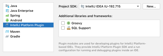
If there is no space under the UI control, use the help tooltip with the question mark icon for labeled inputs, checkboxes and radio buttons. For buttons, use the help tooltip without the icon.
List, tree or table
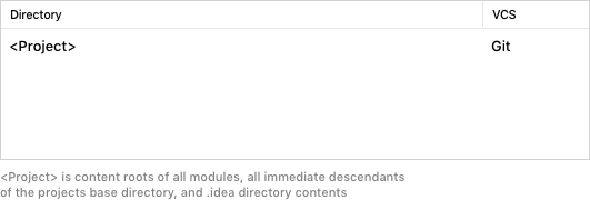
If the help text applies to a whole list, tree, or table, place it under the control.

JTable table = createTable(); // Actual table creation
JBScrollPane pane = new JBScrollPane(table);
pane.setPreferredSize(JBUI.size(400, 300));
pane.putClientProperty(UIUtil.KEEP_BORDER_SIDES, SideBorder.ALL);
JPanel panel = UI.PanelFactory.panel(pane).
withComment("<Project> is content roots of all modules, all immediate descendants<br/>of the projects base directory, and .idea directory contents”).resizeY(true).createPanel();If it applies to a single list, tree or table item:
-
If the help text has 1–10 words, place it to the right of the item.

-
If the text is longer than 10 words:
For a list or tree in the master part, place the text into the detail part.

If the case with the master-detail layout above does not apply, use the help tooltip with the question mark icon.
![]()
Group of controls
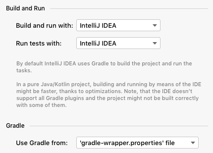
If the help text applies to several UI controls, place it at the bottom of the group.

Implementation
Use IdeaTitledBorder as the border for panels that need title and possibly the gray line on the right of the title:
String INNER_COMMENT = "<p>By default IntelliJ IDEA uses Gradle to build the project and run the tasks.</p>"+
   "<br style=\"font-size: 8;\"/><p>In a pure Java/Kotlin project, building and running by means of IDE might be faster, thanks to optimizations. Note, that the IDE doesn't support all Gradle plugins and the project might not be built correctly with some of them.</p>";
 JPanel innerGrid = UI.PanelFactory.grid().splitColumns().
 add(UI.PanelFactory.panel(new JComboBox<>(new String [] {"IntelliJ IDEA", "Gradle"})).resizeX(false).withLabel("Build and run with:")).
 add(UI.PanelFactory.panel(new JComboBox<>(new String [] {"IntelliJ IDEA", "Gradle"})).resizeX(false).withLabel("Run tests with:")).
 createPanel();
JPanel panel = UI.PanelFactory.panel(innerGrid).withComment(INNER_COMMENT).createPanel();
panel.setBorder(IdeBorderFactory.createTitledBorder("Build and Run"));
You can find more examples in the ComponentPanelTestAction implementation or the Show Standard Panels action.