Layout
Arrange UI controls in dialogs according to the rules below to help people locate the necessary settings faster and understand how they are related.
- Labeled input controls: fields, combo boxes, text areas, etc.
- Checkboxes and radio buttons
- Buttons and links
- Lists, trees, tables
Organize controls into easily readable groups with vertical and horizontal insets.
See Dialog window for buttons and other controls at the bottom of a dialog.
Independent controls
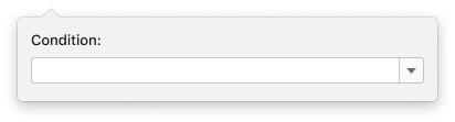
Labeled input controls
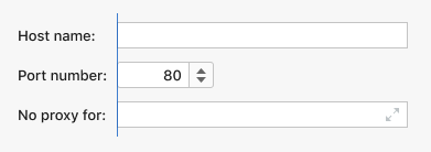
Labeled input controls are: input field, combo box, drop-down list, text area, and spinner.
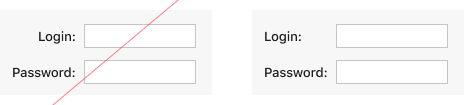
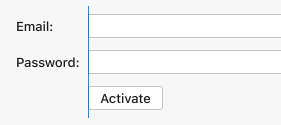
By default, put input controls with labels of similar length on different lines and align their input boxes on the left side.
Do not align input boxes on the left side if one label is twice as long as the other one or even longer.
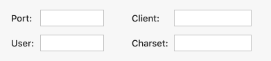
If several related input controls have labels of up to 10 characters and their input boxes are short, organize them in two columns. Do not use more than two columns.
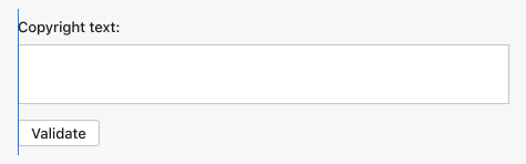
If an input box is long, and the horizontal space is limited, place the label above the box. Otherwise, always put the label and the box on the same line.
Separated by other controls
If there are two input controls with labels of similar length that are separated from each other by a single control, align their input boxes on the left side.
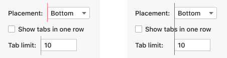
Align only the input boxes of the neighboring input controls. If there’re several input controls on a page, and they are separated from each other by two or more other UI elements, do not align their input boxes.
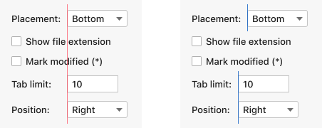
If input groups are separated by a group of other UI controls, align only the boxes located within one group.
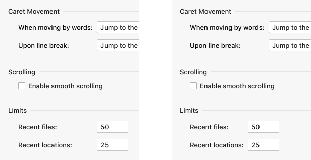
Labels and right borders
Always left-align labels.
Align the right borders of input boxes that have a similar length. For alignment, use built-in icons. Do not use buttons.
Checkboxes and radio buttons
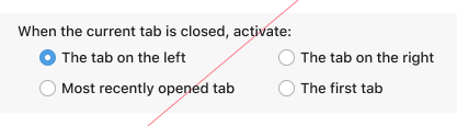
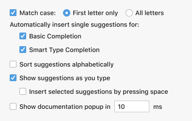
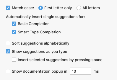
By default, put independent checkboxes and radio button groups on different lines.
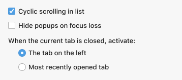
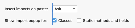
If there is a group of 2–3 checkboxes with short labels (1–3 words), place them on the same line. The same rule applies to radio buttons. With this alignment, controls form a short sentence making it easier to understand their meaning compared to when they are split into several lines.
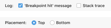
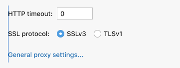
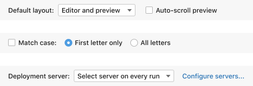
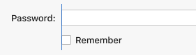
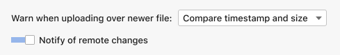
When there is an input control on one line and a group of checkboxes or radio buttons on the next line, and their labels are of similar length (one is no more that 5 characters longer than the other), align the input box with the checkbox/radio button.
If one label is much longer than the other, do not align these UI elements.
If a checkbox group does not have a label, align it with other independent controls by the left side.
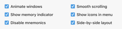
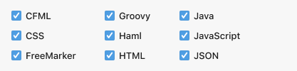
4 and more checkboxes can be arranged in columns:
- Arrange checkboxes with labels of up to 30 characters in 2 columns.
- Arrange checkboxes with labels of up to 15 characters in 3 columns.
Do not arrange radio buttons from one group in several columns. Splitting a group of radio buttons into two or more columns makes it unclear that all these radio buttons belong to the same setting.
Buttons and links
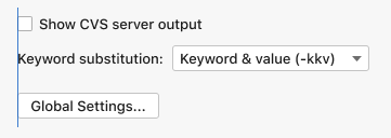
Align an independent button or link to the left with other controls.
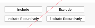
If there are 2–3 buttons or links with labels of up to 30 characters each, place them on one line.

Do not arrange buttons or links in several columns. Such a layout takes more time to parse visually.
Lists, trees and tables
Choose a control width such that most of the common values are visible. Take the whole width of the dialog if necessary.
If the dialog containing the control is noticeably wider than the control itself, reduce the length of the control.
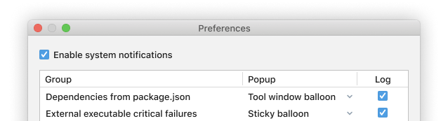
Do not put other independent controls to the right of a list, tree, or table. They would look like dependent controls in the master-detail layout.
If there are several lists, trees, or tables in a dialog, make them of the same width.
Dependent controls
Align controls according to the rules below to show that they are related.
Place 2–3 related UI controls on the same line if each control takes up to 30 characters. This way the user needs to read just one line, and it is quicker to see that the controls depend on each other.
In all other cases, place interrelated controls on different lines:
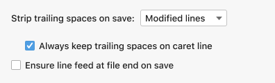
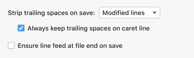
Main control: labeled input control.
- Align other dependent elements with the left border of the input box.
- If an input’s label is long or the input box is very short, align by the label and add a horizontal inset.
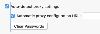
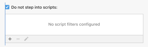
Main control: checkbox or radio button. Align dependent controls by the label.
When the main control or one of the dependent controls takes the whole width of a panel, left align all elements.
 The text area is the main control, the button is the dependent control.
 The checkbox is the main control, the table is the dependent control.
When the main control takes the whole width of a panel, and there is one small dependent control (for example, a drop-down list), place this dependent control to the top-right corner, above the main control.
See Master-detail layout for more information on how to lay out controls if they depend on lists or trees.
See the Inline help text and Tooltip articles for details on how to arrange help information in dialogs.
If controls do not depend on each other, left-align them all. Otherwise, the user might think that controls are linked.
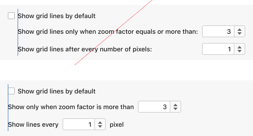 The spinners do not depend on the top checkbox.
Organize with insets
Use vertical insets to break a list of controls into easily readable groups. Compare:
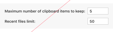
Incorrect
 The list of controls is hard to scan quickly because the controls “stick” together.
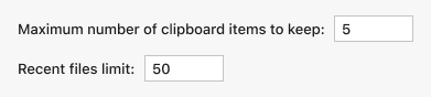
Correct
 Scanning a list of controls becomes easier when vertical insets are added between the groups of controls.
Treat insets with extra care and make sure that elements within a group are actually related. An unnecessary inset may create a false impression that the controls are grouped. This complicates the UI and might cause confusion.
Incorrect
 The first checkbox depends on the combo box which is shown with the horizontal inset. However, the checkboxes appear grouped because they are closer.
Correct
 The first checkbox is closer to its main control and it is easier to see that the combo box and the checkbox are related.
Horizontal insets also matter for grouping controls.
Incorrect
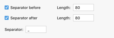 The checkboxes and the “Length” fields look independent because the horizontal inset between them is bigger than the vertical inset below the second checkbox.
Better
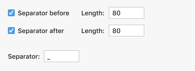 With a smaller horizontal and bigger vertical insets, the checkboxes and the “Length” fields look related. However, it could be made better if the repeating word “Separator” appears only once.
Correct
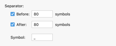 Correct grouping and no duplicates help understanding the UI quicker.
See Groups of controls for how to organize a bigger group of controls.