Writing short and clear
Texts in user interfaces should be short and clear. Short texts save reading time. Clear texts lead to fewer mistakes. Editing methods described below can help with that.
Use simple constructions
Use simple verb forms. Prefer present tense.
Use simple sentences: one idea per sentence.
Avoid passive voice.
This way the same meaning can be expressed with less words. Compare:
Those resources that are available locally → Local resources
Maven has to use → Maven uses
The use of a secure connection is required → Use secure connection
Remove or elaborate generic words
Words like general, advanced, and options do not add useful information and can be removed with no harm to the meaning:

 No meaning is lost after removing group headers “General” and “Options”.
Some generic words cannot be removed. They can appear in actionable elements like buttons, checkboxes or links. Or removing a group header could break a dialog layout. In such cases, use a more informative label instead:
 The link “Learn more” does not explain what useful information could be there for the user to click it.
Remove obvious objects and actions
Remove verbs that explain the function of a UI control:
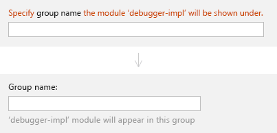 Text boxes are made for input — an explicit instruction “specify” duplicates the meaning expressed by the text field. Additional information can be given under the field — see Context help.
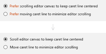 A selected radio button means its option is "preferred". A selected radio button means its option is "preferred". |
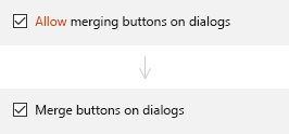 A checked checkbox means its feature A checked checkbox means its feature is "allowed". |
Remove words with a meaning that is already expressed in the label:
 The clipboard’s purpose is to keep information so the infinitive "to keep" is implying the obvious and can be removed.
 |
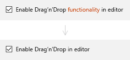 The word “functionality” is already implied by "Drag’n’Drop" and can be removed.
 |
Do not address the user
A user interface is for a person who uses it. Addressing this person is unnecessary because they by default perceive the text they see as for them:

 The whole phrase after the comma is not needed because its meaning is already expressed by the verb “configure”.
Remove duplicates
If the repeating word appears in element labels, move it to the beginning. Finding a setting becomes faster as you scan only meaningful words:

Remove duplicates in meaning:
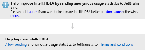
| Before | After | |
|---|---|---|
| Help improve IntelliJ IDEA by sending anonymous usage statistics to JetBrains s.r.o. | Help improve IntelliJ IDEA | The purpose of the header is to attract attention. The shorter and clearer header does that better. |
| if you want to help make IntelliJ IDEA better | Allow sending anonymous usage statistics to JetBrains s.r.o. | “Help make IntelliJ IDEA better” is already expressed in the message header. The body text now explains how the user can do that. |
| more... | Terms and conditions | The link more... does not tell what is behind it — unclear for the user why to click it. |
| Removed | |
|---|---|
| click I agree | The verb "click" is obvious from context: you cannot do much with a link other than click. |
| click... I don’t agree otherwise | The link "I don’t agree" duplicates the notification “Close” button which appears on hover. |
| |
The icon is not needed because the message is purely informative, not an error or a warning. Texts are information by default, there is no need to specify that meaning explicitly. |
Translate from tech to human
When you make a feature, you know how it works from the inside and can describe it from the implementation point of view:
 A person not familiar with implementation details won’t know what the Automatic indent options detector is, why file’s indent options have been overwritten and what indent size=2 means. Translated to the “human” language, the message reads:
 Always write UI text from a user’s perspective. Avoid technical terms, jargon and descriptions of inner logic that a user might not know.
Write for first-time users
After writing a UI text, imagine seeing it for the first time and try to understand what might be unclear or confusing. Then correct if necessary.
 For a first-time user, Enable File Colors enables or disables the other two options (but it does not).
 Rewritten: now all options are equal.
More examples:
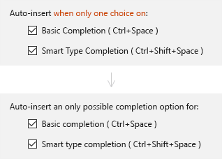 Before: The title can be read as “Auto-insert when only one checkbox is on” making you ask how does it work when both checkboxes are on. After: Replacing choice with completion option makes the title unambiguous.
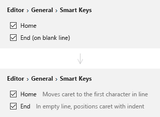 Before: What do smart Home and End keys do? What do they do if they are not smart? After: Added text explains what the options do so that the reader can make an informed choice.
Examples
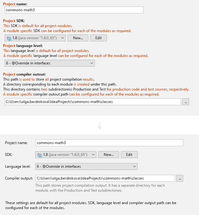
| Before | After | |
|---|---|---|
| Project name Project SDK Project language level |
Project name SDK Language level |
"Project" can be left only for the first field. All others will be understood as project settings because they appear in the same group of UI elements. |
| This path is used to store | This path stores | Simple verb form |
| store all project compilation results | stores project compilation output | “all” is extra because it is implied by default. “results” is another word for “output” — having different words for the same meaning complicates understanding. |
| A directory corresponding to each module is created under this path. This directory contains two subdirectories... | It has a separate directory for each module, with the Production and Test subdirectories. | “is created” is not relevant to the meaning of this phrase. “two” is obvious from context: you see that there are two subdirectories because only two are named. |
| Moved | |
|---|---|
| This [field name] is default for all project modules. A module specific [field name] can be configured for each of the modules is required. | This phrase is repeated for all fields. Can be shown only once at the bottom of the dialog. |
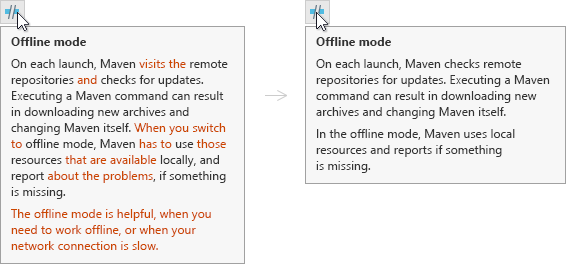
| Before | After | |
|---|---|---|
| visits the remote repositories and checks for updates | checks remote repositories for updates | “Checks” already includes the meaning of “visits”. |
| When you switch to offline mode | In the offline mode | The action “switched” is not relevant for the meaning of this phrase. Also, an unnecessary reference to the user — “you”. |
| Maven has to use | Maven uses | Not relevant that a technology must do something, enough to say it just works this way. |
| those resources that are available locally | local resources | |
| reports about the problems if something is missing | reports if something is missing |
| Removed | |
|---|---|
| The offline mode is helpful when you need to work offline | The phrase does not explain when the offline mode is helpful. It should either be elaborated or removed. |
| or when your network connection is slow | Only one of possible uses for the offline mode and an obvious one. Can be removed for a more concise text. |