Banner
A banner notification informs the user about the state of a specific context in the project. For example, when there is a missing or broken configuration for some file.
When to use
Use a banner if user actions should attract attention in a file tab, tool window, or dialog, but are not required immediately.
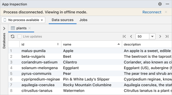 Reconnecting to the database is required to make edits.
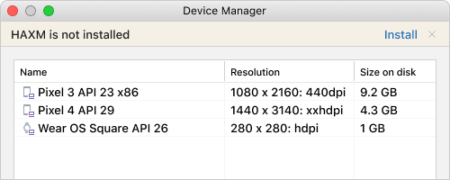 The component needs to be installed in order to run the available virtual devices.
Do not use a banner if there is no particular UI component it can be tied to. Use a balloon notification in the main window instead.
For all other cases, choose another notification type.
Types of banners
Information
Use when actions can improve the user’s workflow, but are considered optional and can be safely ignored.
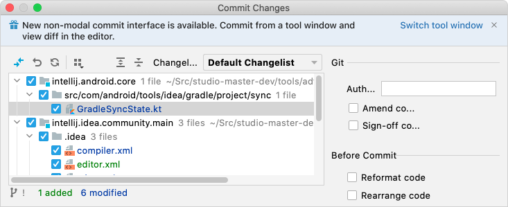 The new tool window UI is suggested to improve the workflow for version control.
Warning
Use to suggest actions that can impact the user’s workflow.
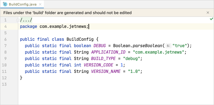 Generated files should be edited directly.
Error
Use to suggest actions that are required to unblock the user’s workflow.
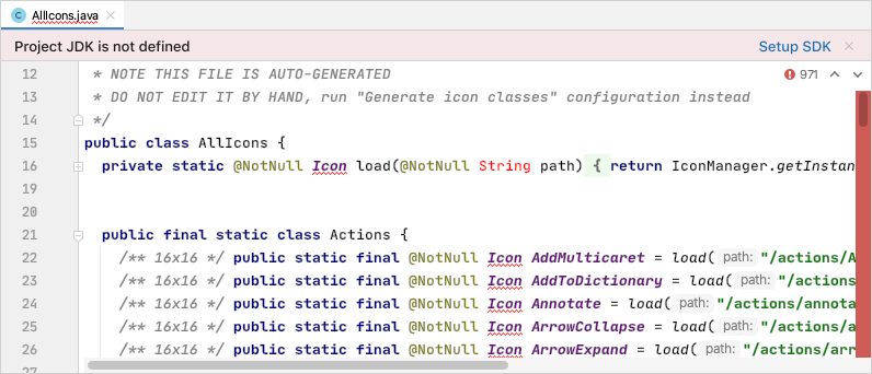
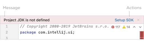
Syntax highlighting and other inspections are broken until a JDK is defined for the project.
How to use
Message
- The message should be short and descriptive (two sentences at most) and follow the Punctuation guide.
- Use sentence case capitalization.
Actions
- The action name should be short and descriptive, preferably not longer than two–three words.
- Use sentence case capitalization.
- Limit the number of actions to two to make the call to action clear in the specific context.
- Use the built-in ‘Hide’ action instead of creating a separate one.
Icon (optional)
- 16x16 icons can be used to complement the message, e.g. a gift icon to advertise functionality.
Placement
- Place the banner at the top of the related UI component.
- It can float or be adjacent to the content, depending on the amount of the available space and whether or not the content’s vertical shifting needs to be minimized.
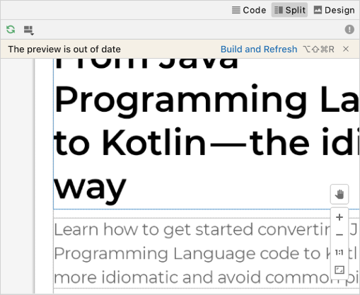 The banner floats on top of the preview surface to reduce shifting during code editing.