Context help
Use context help to briefly explain how a functionality works if it is not clear from the UI and the application behavior. Provide full description of the functionality in product web help.
There are three ways to show context help:
- in a help tooltip
- as inline help text
- in an empty state
This article explains when to use the first two. For when to use the empty state, see the Empty state.
Inline text or a tooltip
Use inline help text in settings dialogs:
- Settings are rarely changed. Users may forget what a setting does when they use it the next time, so it makes sense to provide additional information straight away.
- Settings dialogs are usually not constrained in space. In most cases it is possible to fit in a help text.

Use a help tooltip if:
- A dialog is often used. The more often a person uses an interface, the more likely they are to remember what each option does.
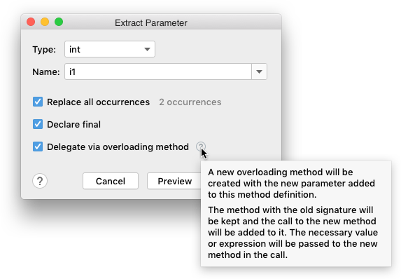 A refactoring dialog is used more often than a settings dialog. A help tooltip is less distracting than an inline help text.
-
There is no space for an inline text.

-
The control that needs explanation is an icon or does not have a label.
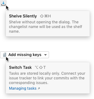
When to use context help
Explain complex behavior that a short action or a setting name cannot convey clearly.
![]()

Explain IDE-specific entities.

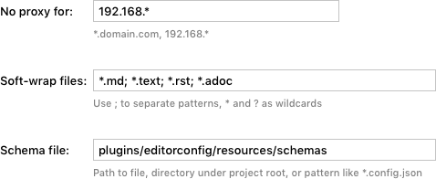
Provide input format requirements and examples.
Suggest alternative ways.

Warn about possible problems.

Explain limitations.

Provide quick navigation to related settings.

When not to use
Do not use context help to explain how the user interface works. If you need to explain that, consider redesigning the UI.
Incorrect
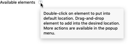
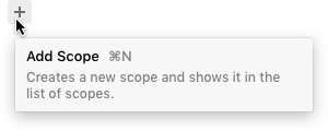
Do not explain common actions and entities. Show a regular tooltip with an action name and shortcut in this case.
|
Incorrect |
Correct |
|

|
Do not explain each option. Too many help icons or too much inline text make a dialog cluttered and harder to navigate visually. If all options need to be explained, consider rewriting the labels to make them clearer.
Incorrect

How to use
See Inline help text and Tooltip.