Button

When to use
Use a button to invoke an immediate action.
Use a link instead if:
- The action takes the user to another page of the same dialog or an external source like documentation:
 The Manage scope link takes to another page of the Settings dialog.
Exception: Next and Previous buttons in wizard navigation.
 - The command is a secondary action that is not related to the primary purpose of the window and the space is constrained.
Incorrect

Correct

Use toolbar buttons instead if there are several buttons related to a table or list:
Incorrect

Correct
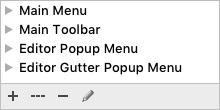
Use a split button instead if:
- There are several related actions (more than 2) but the space is limited and/or packed.
- The action is not common and is dangerous, for example, can destroy user data and cannot be easily undone.
Use a built-in button instead if it’s related to an input field, combo box, search field.
How to use
Label
The label displays the action the button performs.
Write the label as an imperative verb, e.g. Save, Print, Cancel. Use title capitalization.
Exceptions: standard buttons like OK, Back/Forward, Previous/Next, Yes/No, Agree, Options, Settings, Details.
The button should answer the question in the title, so the user can skip the description. Prefer specific labels over generic ones:
| Incorrect |
Correct |
 Unclear what happens on the click. Unclear what happens on the click. |
 The label indicates what happens on the click. The label indicates what happens on the click. |
Exception: the Cancel button if it is clear what action is being canceled. For example:
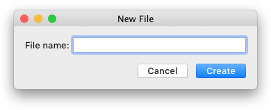 Use the Cancel button, not the Don’t Create button.
The label should be short, not more than 5 words. If it’s not obvious what element the button is related to, add more words to make it clear. Prefer clear labels to short:
| Acceptable |
Better |
 |
|
Add an ellipsis if additional actions such as adding more info or confirming the action are required:
 Do not add ellipsis if another window is opened, but no more input from the user is required. For example, About, Details.
Do not use the word Now in the label because button always trigger an immediate action:
Incorrect

Correct

Use the Close label only if nothing can be changed in the dialog and there is no confirmation button, for example in the Productivity Guide dialog. In all other cases, use the Cancel button.
Do not add an icon to the button. The main purpose of an icon is to quickly find a familiar action in a packed toolbar or menu. Usually, no more than 3 buttons are placed nearby, their labels can be scanned quickly and icons are not required.
Hover
On hovering over a button, show a tooltip with the shortcut and the action name if it can be clarified. For more details see Context help.
 If the action is clear, show the shortcut only. If the action is clear, show the shortcut only. |
 If the action can be clarified, show the action name and the shortcut. If the action can be clarified, show the action name and the shortcut. |
Button states
Default
 Mac OS Mac OS |
 Windows Windows |
The default button confirms the main purpose of a dialog. It is triggered by pressing Enter or
Ctrl+Enter on Windows/Linux and Enter or Cmd+Enter on macOS.
Exception: If the focus is on an element that uses the Enter key (e.g. a text
area), the default button is triggered only by Ctrl+Enter on Windows/Linux and Cmd+Enter on macOS.
The default button should be always present in a dialog. Only one button in a dialog can be the default one.
If the action is dangerous, e.g. can lead to data loss, provide an easy way to undo the command. See Dangerous actions for more details.
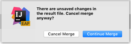
If it’s not posible to undo the action, make a secondary button the default one:
Focused

All buttons can get focus, even on Mac OS if the Full Keyboard Access option is disabled in Preferences > Keyboard > Shortcuts. A focused button behavior varies on Mac OS/Linux and Windows.
Mac OS
-
A focused button is invoked by pressing Space. Focused and default buttons are independent, so when the focus moves from one button to another, the default button does not change.
-
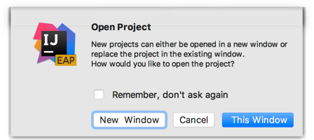
Make the second most popular button in the dialog focused. For example, the New Window button in the Open Project dialog:
-
It’s recommended to have one default and one focused button, so that most of the actions can be triggered using the keyboard.
Incorrect
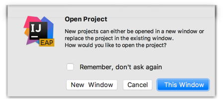 The This Window button is the default and the focused one, while it’s better to place the focus on the New Window button, so that the user can access both options using the keyboard.
Windows/Linux
- The focused button is triggered by pressing Enter or Space. If non-default button gets focus, the default button is invoked using Ctrl+Enter.
 On pressing the Tab key, the New Window button gets the focus and is triggered with Enter or Space. The original This Window button is triggered with Ctrl+Enter.
If the focus moves to a control that’s not a button, the original default button is triggered by Enter.
Disabled

Disable a button if:
- It’s an Apply button and no changes have been made in this dialog.
- The control to which the button is related is disabled.
- Not all required fields in the dialog are filled. For more details, see the Required fields.
Other common buttons are described below. They can be regular or default buttons.
Cancel
The Cancel button reverts the app to the state before the dialog was invoked, and works equivalent to the Esc key on Win and Linux, and Esc or Cmd+Period on Mac. If a confirmation button is present in a dialog, e.g. OK or Save, it’s recommended to have a button that cancels the dialog, e.g. Cancel, Continue Editing, etc.
Apply
Use the Apply button in dialogs with many settings that affect how data is displayed. The Apply button allows you to save and preview the effect of the selected options, and continue changing the settings, for example, change a scheme in Settings.
Help
The help button appears in the bottom-left corner of a dialog and shows help in a tooltip on hover, or opens a help dialog on clicking it. For more details see Context help.

Sizes and placement
The button width accommodates the length of the label plus standard indents 14px, but not less than the 72px.

The button height is fixed, so the label is always a single line.
To lay out the button that depends on other control, e.g. input field, follow the rules for dependent controls. Otherwise, follow the rules for independent controls.