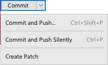
Split button
The Split button is a button which has two parts — the main action on the left and a control button which shows a dropdown with less common actions on the right.
When to use
Use the split button:
When more than 2 related actions are possible but the space is limited and/or packed:
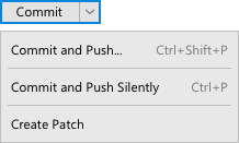
For example, it is useful for the Commit actions group in the Commit dialog:

The Split button is not useful in the Replace popup, since not all actions are related, for example Open in Find Window is not related to the main action. Such actions are hard to find in the drop-down menu:
Incorrect

Correct

In the Adjust Code Style dialog only 1 related action is possible and it does not save a lot of space:
Incorrect

Correct

To hide actions which are dangerous and uncommon. Dangerous means an action can destroy users’ data and cannot be easily undone. It is less possible to accidentally click an action hidden in a menu. It is recommended to hide even a single related uncommon dangerous action.
For example, Force Push can override remote commits from other authors and should not be easily available:

If an action is dangerous but common, do not hide it under the split button, use simple buttons. An action should follow the principles for dangerous actions behavior.
Do not use the Split Button in other cases, use simple Buttons instead.
How to use
Main action
Click |
|
Control button
Click |
|
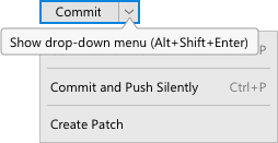
Hover |
|
Dropdown menu
Place actions related to the main button’s action in the dropdown menu.
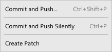
Do not duplicate the main action in the dropdown menu, otherwise it is confusing how to trigger the main action — with the button or from the menu.
Reduce split button to simple action buttons
The Split button can be reduced to simple action buttons which are layed out automatically next to each other. This is controlled by the following option in settings:
Appearance & Behavior > Appearance > Merge buttons in dialogs
For example, the Commit button reduced to its components (the option is disabled) looks like the following:

Keyboard navigation & shortcuts
Trigger the main action when the default button shortcut is pressed if the split button is the default one.
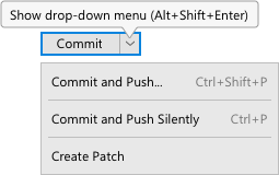
Open the dropdown menu with the first menu item selected on Alt+Shift+Enter.
Do not show the dropdown menu when the button gains focus.
Focus on the button
Enter \ Ctrl+Enter |
|
Space |
|
Arrow Down |
|
Tab \ Shift + Tab |
|
Focus in the drop-down menu
Enter \ Space |
|
Arrow Down \ Up |
|
Esc |
|
Sizes and placement
Follow the rules for the simple button.
Button
The width of the split button equals to the width of the main button (follow the rules of the simple button) plus the width of the drop-down button.
Windows: |
Mac: |
Darcula: |
 |
 |
 |
A different width for the split button makes it easier to understand that this button is different from other buttons in the dialog.
Drop-down menu
Follow the rules for menus with regard to sizes, colors, fonts and spacing.
Menu item height and spacing between the menu and the button:
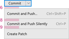
Style
Increase line height in the dropdown menu to lessen the chance of choosing the wrong menu item by mistake.
Leave 2px around the separator inactive to lessen the chance of choosing the wrong menu item by mistake:
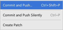
Align the dropdown with the button left border:
