Built-in button
A built-in button is an icon placed inside an input control.

How to use
Place the built-in button inside the input control. Do not place the built-in button on the right of a control:

To place a button inside a text field, use the com.intellij.ui.components.fields.ExtendableTextField class and
its addExtension method.
The shortcut for a built-in button is Shift+Enter.
Types
Browse
A browse button opens a dialog with the disk, a tree view or a table of values.
Use a control with the browse icon for a file/folder path selected from the disk.

An input field with browse button:
com.intellij.openapi.ui.TextFieldWithBrowseButtonA combo box with browse button:
ExtendableTextComponent.Extension browseExtension =
  ExtendableTextComponent.Extension.create(AllIcons.General.OpenDisk, AllIcons.General.OpenDiskHover,
                                         "Open file", () -> System.out.println("Browse file clicked"));

ComboBox<String> eComboBox = new ComboBox<>(STRING_VALUES);
eComboBox.setEditable(true);
eComboBox.setEditor(new BasicComboBoxEditor(){
  @Override
  protected JTextField createEditorComponent() {
    ExtendableTextField ecbEditor = new ExtendableTextField();
    ecbEditor.addExtension(browseExtension);
    ecbEditor.setBorder(null);
    return ecbEditor;
  }
});
Do not place the button on the right of the control.

Expand field
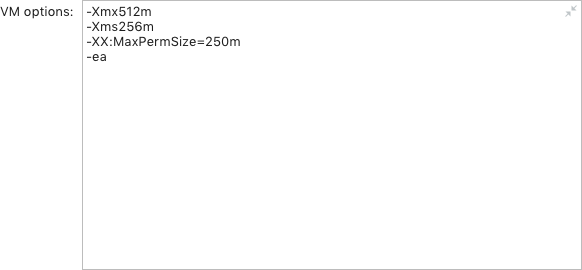
If input text can be long and place is constrained, use built-in button to expand the control (com.intellij.ui.components.fields.ExpandableTextField):


Do not use the Show Viewer button instead.

List values
Use a control with the table icon to select from the list of classes, methods or environment variables:

Use a combo box instead of the Variables button. This icon works as a combo box.

Add value
The Plus button works the same way as the Browse button, the only difference is that the selected value is added, instead of overwriting the existing one. Place the plus icon inside the control.

Copy, Info
 |
Do not use the Copy button, the content can be selected and copied using the Cmd/Ctrl+C shortcut or the context menu. |
 |
Do not use the info button to open an external link. Use context help instead. |