Radio button

When to use
Use a radio button group to choose one option from 2–4 mutually exclusive options.
Do not use radio buttons if:
- Several options in a group can be selected. Use a group of checkboxes instead.
-
There are only 2 opposite yes/no options. Use a checkbox instead.

-
There are 5 and more options that can be charted on an axis, e.g. time delay. Use a slider instead.
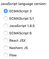
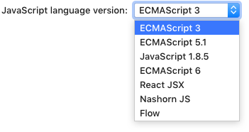
- There are 5 and more options. Use a drop-down list:
Incorrect
Correct


Consider using a drop-down list if:
- The screen space is limited.
- The option might be used less often than other options on the screen.
- There are other drop-down lists in the same group of UI components. A radio button group is more noticeable than a drop-down list so it will look like a more important setting.
- There is a combination of several UI components for one setting:
 The automatic updates setting consists of a checkbox, three lengthy-labeled options in a dropdown and a button.
How to use
Label
A label accompanies each checkbox and is placed next to it.

If a label is long, split it into two lines. Avoid labels that take more than two lines. See recommendations on writing concise labels below.

To implement this, use HTML formatting:
JRadioButton radioButton = new JRadioButton(
    "<html>Show options before adding<br>to version control</html>");
Writing guidelines
Use sentence-style capitalization.
Do not use ending punctuation.
Use the imperative form of verbs.
Do not use negation in labels as it complicates understanding.
Incorrect

Correct

Make labels short and intelligible — see Writing short and clear text.
Group label

Always start a radio button group with a group label. It explains what the options are for.
Use a checkbox or another radio button as a group label if the radio button group needs to be turned on or off.
Use a colon at the end of a group label.
Sizes and placement
If a radio button group depends on another control, e.g. a checkbox, follow the rules for dependent controls. Otherwise, follow the rules for independent controls.