Checkbox

When to use
Use checkboxes for yes/no choices or for selecting several items in a group.
Do not use checkboxes if:
- Only one option in a group can be selected. Use a radio button group instead.
- The behavior in the “off” state is unclear from the checkbox label. Use two radio buttons instead and label them accordingly.
 With the checkbox, it is unclear how the setting works if it’s unchecked. With radio buttons, both states are labeled clearly.
How to use
Label
A label accompanies each checkbox and is placed next to it.

If a label is long, split it into two lines. Use HTML formatting for that.

JCheckBox checkBox = new JCheckBox(
    "<html>Insert selected suggestion by  pressing space, dot,<br/>" +
    "or other context-dependent keys</html>");
Avoid labels that take more than two lines. See recommendations on writing concise labels below.
If a checkbox appears in a table, place the label into the column header and do not repeat it on every row.
 Implementation: Checkboxes are rendered in tables with
 BooleanTableCellRenderer and edited with DefaultCellEditor(JCheckBox) implementation. For any column that should be rendered as a checkbox, set both a renderer and editor for consistency. The type of data in the correspondent column of the Table model should either be Boolean or String containing true or false.
TableColumn col = table.getColumnModel().getColumn(...);
col.setCellEditor(JBTable.createBooleanEditor());
col.setCellRenderer(new BooleanTableCellRender());
Writing guidelines
Use sentence-style capitalization.
Do not use ending punctuation.
Use the imperative form of verbs.

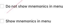
Do not use negation in labels as it complicates understanding.
Exception: “Do not show again” checkbox.

Make labels short and intelligible — see Writing short and clear.
Three-state checkbox
In a group of options, use the parent checkbox to show the status of its children.
 The parent checkbox in checked, indeterminate and unchecked states
Implementation: The three-state checkbox is represented by the
 ThreeStateCheckBox class which represents its state with the ThreeStateCheckBox.State enum containing SELECTED, NOT_SELECTED, DONT_CARE states.
When the user clicks an indeterminate checkbox for the first time, the whole group becomes checked. The second click unchecks the whole group.
An indeterminate checkbox can also show the download status. An example with a remote repository:
 Repositories “tools-base” and “contrib” are being loaded. When loading is finished, the indeterminate checkbox will be replaced with the checked checkbox if there are commits, or an unchecked checkbox if there are no commits.
Implementation: In a table, the three-state checkbox is represented by
 ThreeStateCheckBoxRenderer that provides both TableCellRenderer and TableEditor. It accepts Boolean type in the column being supplied by the TableModel and becomes DONT_CARE when the value in the cell is null. Otherwise it becomes SELECTED for Boolean.TRUE, and NOT_SELECTED for Boolean.FALSE.
Placement
If a checkbox depends on another control, e.g. an input field, follow the rules for dependent controls. Otherwise, follow the rules for independent controls.