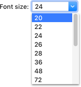
Combo box
A combo box combines a drop-down list and an input field, allowing the user to select a value from the list or enter a custom value.

Use com.intellij.openapi.ui.ComboBox instead of javax.swing.JComboBox. To make combo box editable call:
comboBox.setEditable(true)When to use
Use a combo box if:
-
The user needs to select a value or enter a custom value.

-
The possible choices are objects or states.
-
The user may need to return to previous values. For example, save previously entered paths, so the user can quickly select them later:

When not to use
If the number of options is finite, and there’s no need to enter custom values. In this case, use a drop-down list or radio buttons.
If it’s not possible to list the most likely choices. In this case, use an input field instead.

If the list is big and the user knows what value they need and won’t review the list. In this case, use an input field with completion.

How to use
For the label and the default value apply the same rules as for the drop-down list.
If there are no values in the list initially, replace the combo box with an input field. This way users won’t waste their time clicking the empty combo box to find out that there are no options available.
| Incorrect |
Correct |
 |
 |
Replace the input field with a combo box after a value has been entered and confirmed.
Menu
Control
Open the combo box menu on clicking the arrow button on the right or pressing the Down key when the combo box is
focused.
The menu opens down by default. If there is not enough space, the menu opens up.
When the menu opens, select the element that was shown in the closed combo box. If a custom value is entered, then do not select a value in the list.
Move the selection in the menu and update the value in the combo box on pressing the Up and Down arrow keys. On mouse hover, move the selection to an item the cursor is pointing to, and, update the value on clicking the mouse button or pressing Enter.
The menu remains opened until the user clicks the item in the list, presses Enter or Esc, clicks outside the menu, or switches to another app.
Menu items
The menu list contains predefined or the most likely options. Follow the rules for drop-down menu items.
If the user needs to return to previous inputs, add such values to the end of the list on clicking confirmation button in the dialog.

Use built-in buttons to add values or expand the combo box, e.g. the browse button:

Validation
If the user enters an invalid value, highlight the combo box with red and show an error message in a tooltip. For more details see Validation errors.

Sizes and placement
Follow the drop-down guidelines.