Widgets
Bool
Language Namespace : de.itemis.mps.editor.bool
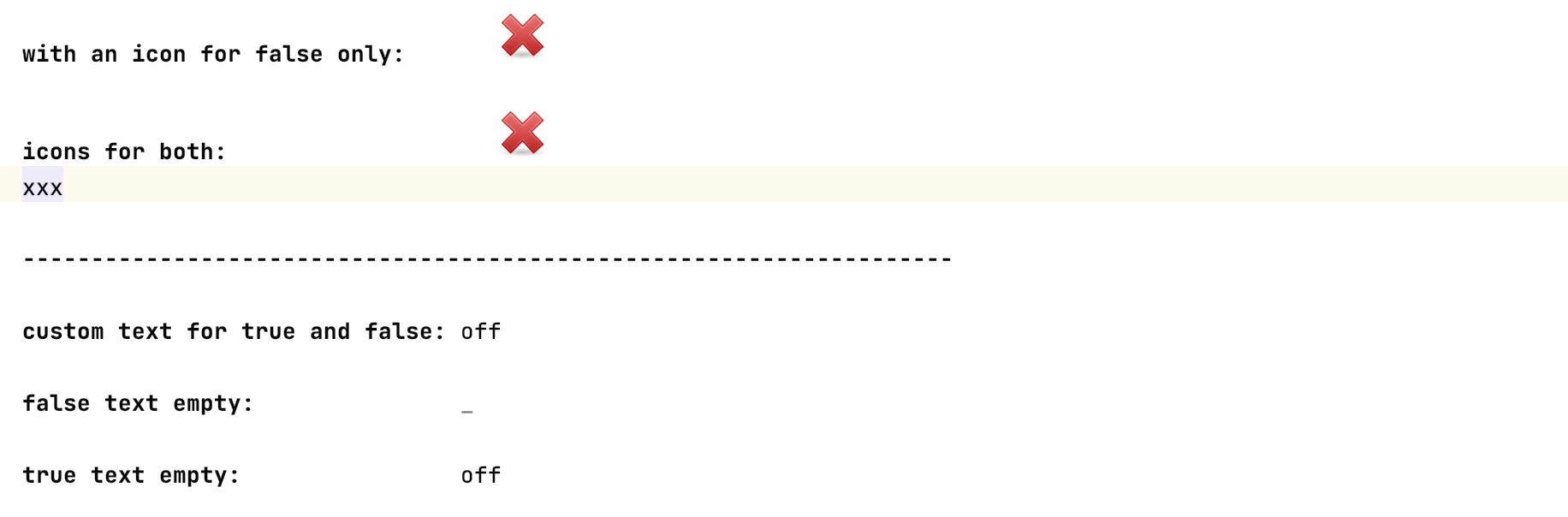
This language adds support for manipulating boolean values. When using the checkbox cell, the value can be toggled by clicking on
the image. When using the boolcell, a custom text can be set and the values can be toggled by typing the
corresponding text or using the code completion menu.
Collapsible
Language Namespace : de.itemis.mps.editor.collapsible
This language adds more folding functionality that the MPS collection cll folding mechanism doesn’t offer.
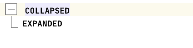
Two cells have to be added to the collapsible cell: the collapsed cell which is shown in the collapsed state and the expanded cell which
is only shown when the cell isn’t in the collapsed state. The following style properties can be set:
- show collapsed always: always show the collapsed cell even when the cell is expanded (default: true)
- collapsed by default: start in the collapsed state (default: true)
- bracket line: draw brackets around the cell (default: true)
- group: if multiple collapsible cells have the same group, edges are drawn between these cells.
- node size: the size of the toggle button (unit: pixel)
- paint node: a custom paint method for the toggle button
- paint edge: a custom painted edge starting from the end of the line to the expanded cell
- paint line: a custom painted line starting at the node and ending at the height of the full collapsible cell
Dropdown
Language Namespace : de.itemis.mps.editor.dropdown
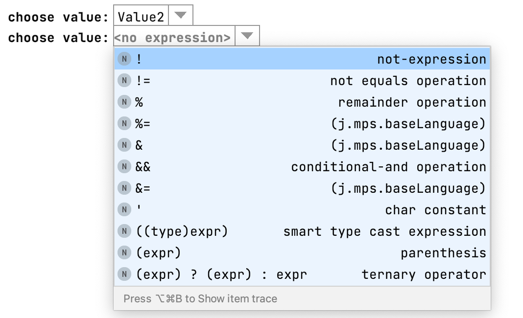
A simple cell that makes a containing displays a cell as a dropdown menu: it surrounds a cell with a border and an icon to the right side of it that opens the code completion menu.
Enumeration
Language Namespace : de.itemis.mps.editor.enumeration
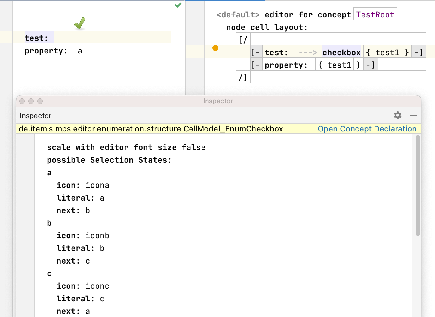
The cell enum_checkbox can be seen as an extension of the boolean language for more than two states. Select a enumeration
property that should be used for the states of the checkbox. A quickfix automatically adds the enumeration values to the
possible states section (if not: press F5 in the editor). Then an icon and the next state have to be declared. Declare the
icons by using the IconCollection concept. To avoid hard-coded paths, use path variables to set the path to the icon
e.g. ${extensions.home}/code/widgets/languages/de.itemis.mps.editor.bool.demolang/icons/dialog-ok-3.png. Set the scale of
the individual icons. The overall scaling of the checkbox icons can be influenced by setting the property scale with editor font size
in the inspector.
Swing
Language Namespace : nl.f1re.mps.editor.swing
This language adds a new swing component cell that can be customized and also sets some sensible default values for the component:
- component provider: created the swing component
- font: this function sets the font of the component. Use the helper class
FontHelperto access predefined fonts. - string representation: customize the plain text representation of the component when pasting to the clipboard